WorkLoDo Studios
A brand for the studio we call home
- Client
- LoDo Studios
- Industry
- Creative space
- Services
- Brand Identity, Logo System, Icon Design, Brand Texture, Typography + Color, Brand Style Guide, Website Design
- Website
- lodostudios.com
The challenge
LoDo Studios is an open production and event space at 216 East Gutierrez Street in lower downtown Santa Barbara, and the building Wonder and Wit calls home. In a single week, the same rooms can host photo and video shoots, livestreams and voiceover sessions, then turn into a venue for mixers, screenings, comedy nights, workshops and parties. The space needed one brand flexible enough to hold all of it, and bold enough to stand out on its own.
What we did
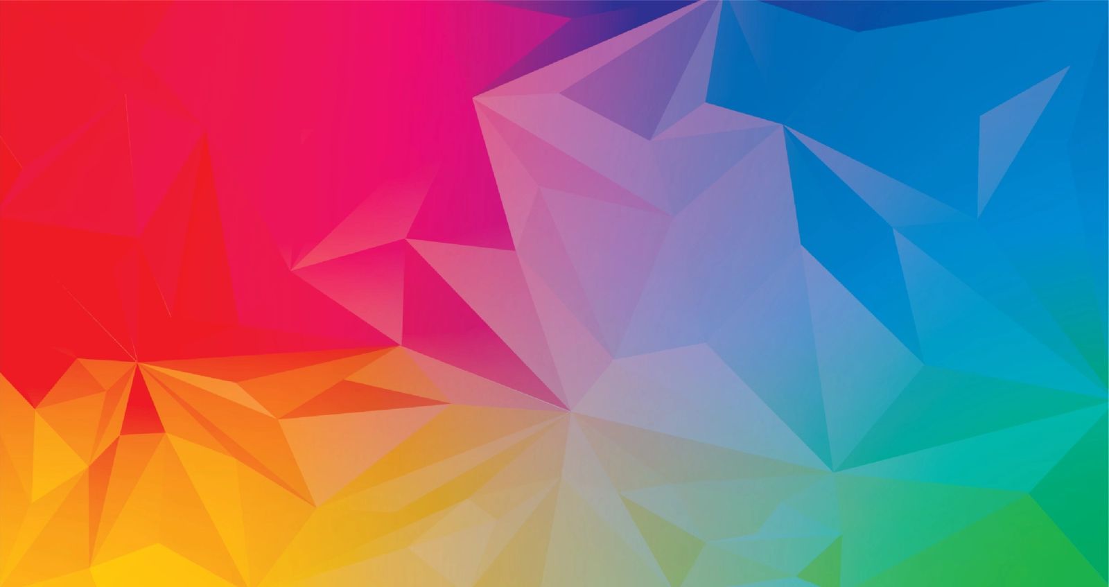
We started with the name. The LODO wordmark is built from four rounded, modular letterforms that stack and rearrange into a horizontal lockup, a vertical lockup and a compact icon. Each comes in filled and outline versions, in black, white and full color, with a dedicated icon for the production and events side of the business. Inside the letters lives a prismatic, low-poly texture that moves from red and magenta through violet and blue to teal and gold. It works like stage lighting: the same brand can feel warm for an evening event or cool and technical on a production day. All Round Gothic gives headlines the same rounded geometry as the logo, Proxima Nova handles everything else, and a nine-color palette pulls straight from the texture. We pulled it all together in a brand style guide and a homepage design for lodostudios.com, so the identity reads the same everywhere the space shows up.
The result
LoDo Studios has carried this brand since 2022, from lodostudios.com to the productions and events it hosts. And because we work in the building, we get to see it in use every day.

Building something like this?
Tell us a little about your project and we'll set up a quick discovery call to talk through goals and next steps.
Start a Project